Aller au contenu principal
Modèle d’image par IA
ByteDance
Seedream

Seedream 4.5

Seedream 4.5 / Fonctions — La présentation officielle de ByteDance met notamment en avant l’édition multi-image, la conservation des détails des références, la mise en page et le rendu du texte. L’accès proposé par Kyeo a ses propres limites : prompt de 3 000 caractères au maximum, 8 formats et, pour une édition, jusqu’à 14 images JPG, PNG ou WebP de 10 Mo chacune. Kyeo AI facture actuellement 7 crédits fixes par requête, au même tarif pour basic et high. Le budget réel dépend aussi du nombre de nouveaux essais, du taux de retouche et de la proportion de résultats finalement exploitables.

Fonctions
Texte vers image, image vers image
Crédits
7 crédits / génération
Limite du prompt
3 000 caractères
Limite d’import
Jusqu’à 14 images en édition
L’essentiel en 30 secondes
  • Seedream 4.5 / Fonctions — La présentation officielle de ByteDance met en avant l’édition multi-image, la conservation des détails et le rendu du texte
  • Seedream 4.5 / Accès — Une même entrée Kyeo couvre la génération à partir de texte et l’édition par références
  • Seedream 4.5 / Crédits — Kyeo AI facture actuellement 7 crédits fixes par requête, au même tarif pour basic et high. Le budget réel dépend aussi du nombre de nouveaux essais, du taux de retouche et de la proportion de résultats finalement exploitables.
  • Seedream 4.5 / Format / Qualité — 8 formats, avec une sortie basic 2K ou high 4K

Recherches populaires: comment utiliser Seedream 4.5 sur Kyeo AI · combien de crédits consomme Seedream 4.5 par requête · quels paramètres peut-on régler avec Seedream 4.5

Exemples

Visual concept

Visual concept

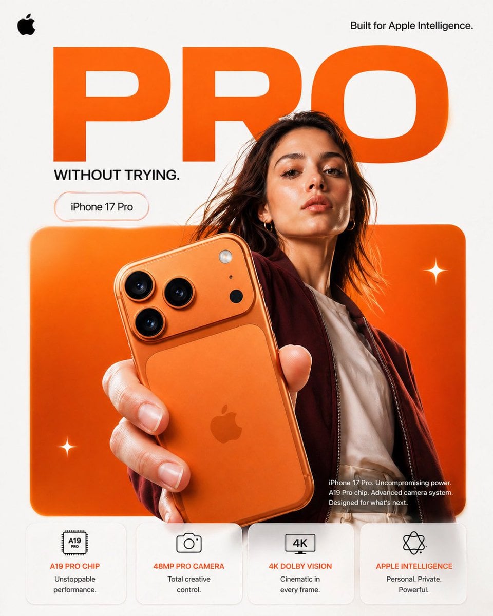
FORMAT: 4:5 vertical premium smartphone campaign poster, ultra-high resolution (8K), global OOH + digital + social ready Style: Apple-level minimalism × bold Gen-Z composition × hyper-real commercial photography 🧠 CORE INTENT: “PRO, WITHOUT TRYING.” Effortless power. Quiet confidence. No noise — just precision. 🎬 SCENE COMPOSITION: BACKGROUND: Pure matte white canvas with a dominant rounded rectangle block in ultra-vibrant burnt orange gradient (top-left → bottom-right glow) GIANT TYPOGRAPHY (BACKGROUND LAYER): “PRO” - ultra-bold geometric sans-serif - stretched wide kerning - partially cropped by frame edges - soft shadow depth - color: deep orange slightly darker than background block - subtle emboss effect 👤 SUBJECT (HUMAN ELEMENT): - Female model, clean editorial look (Apple casting style) - Neutral expression (confident, calm, not smiling) - Hair: natural flow, slightly wind-touched - Outfit: → muted tones (off-white + deep maroon jacket) → minimal styling, no distractions POSE: - Shot from slightly low angle (hero perspective) - One hand extended toward camera holding iPhone - Body slightly angled for depth - Face aligned toward viewer (eye contact) 📱 PRODUCT (HERO FOCUS): DEVICE: iPhone 17 Pro in Titanium Orange finish POSITION: - Extreme foreground (forced perspective) - Slight tilt to reveal camera module depth DETAILING: - triple camera system hyper-sharp - lens reflections physically accurate - brushed titanium edge highlights - micro-scratches + realistic material response - Apple logo centered, subtle reflective gloss REFLECTION: - soft studio reflection on device edges - micro light bloom around camera rings ✨ LIGHTING SYSTEM: MAIN LIGHT: Soft studio key light (front-left) → smooth skin tones → clean product highlights RIM LIGHT: Warm edge light from right → enhances phone silhouette → highlights metallic edges ACCENT LIGHT: Subtle glow from background orange block SHADOW: Soft drop shadow under subject + phone (no harsh contrast) 🎨 COLOR SYSTEM: - Primary: Apple Orange (hero) - Secondary: Clean white - Accent: warm highlights + skin tones - Contrast: deep micro-shadows No over-saturation. No neon. Controlled premium palette. ✨ GRAPHIC ELEMENTS: - Minimal sparkle icons ✦ (2–3 only) - Soft floating UI pill (glass morphism) - Very subtle grain for realism ✍️ TYPOGRAPHY SYSTEM: TOP LEFT: Apple logo (black, small, clean) TOP RIGHT: “Built for Apple Intelligence.” (thin sans-serif) MID LEFT (pill): “iPhone 17 Pro” CENTER DOMINANT: “PRO” (background type) BOTTOM RIGHT (body text): Small paragraph: “iPhone 17 Pro. Uncompromising power. A19 Pro chip. Advanced camera system. Designed for what’s next.” 📊 FEATURE STRIP (BOTTOM GRID): 4 rounded cards (glass-white panels): 1. A19 PRO CHIP “Unstoppable performance.” 2. 48MP PRO CAMERA “Total creative control.” 3. 4K DOLBY VISION “Cinematic in every frame.” 4. APPLE INTELLIGENCE “Personal. Private. Powerful.” Icons minimal line style 📐 COMPOSITION GRID: - Top: brand + statement - Mid: subject + product (dominant) - Background: typography layer - Bottom: feature modules Eye flow: Face → Phone → Camera → “PRO” → Features 🎥 CAMERA SPECS: - ARRI Alexa Mini LF - 50mm anamorphic lens - shallow depth of field - HDR rendering - ultra-real skin + material detail - slight lens distortion for realism
Visual concept

Visual concept

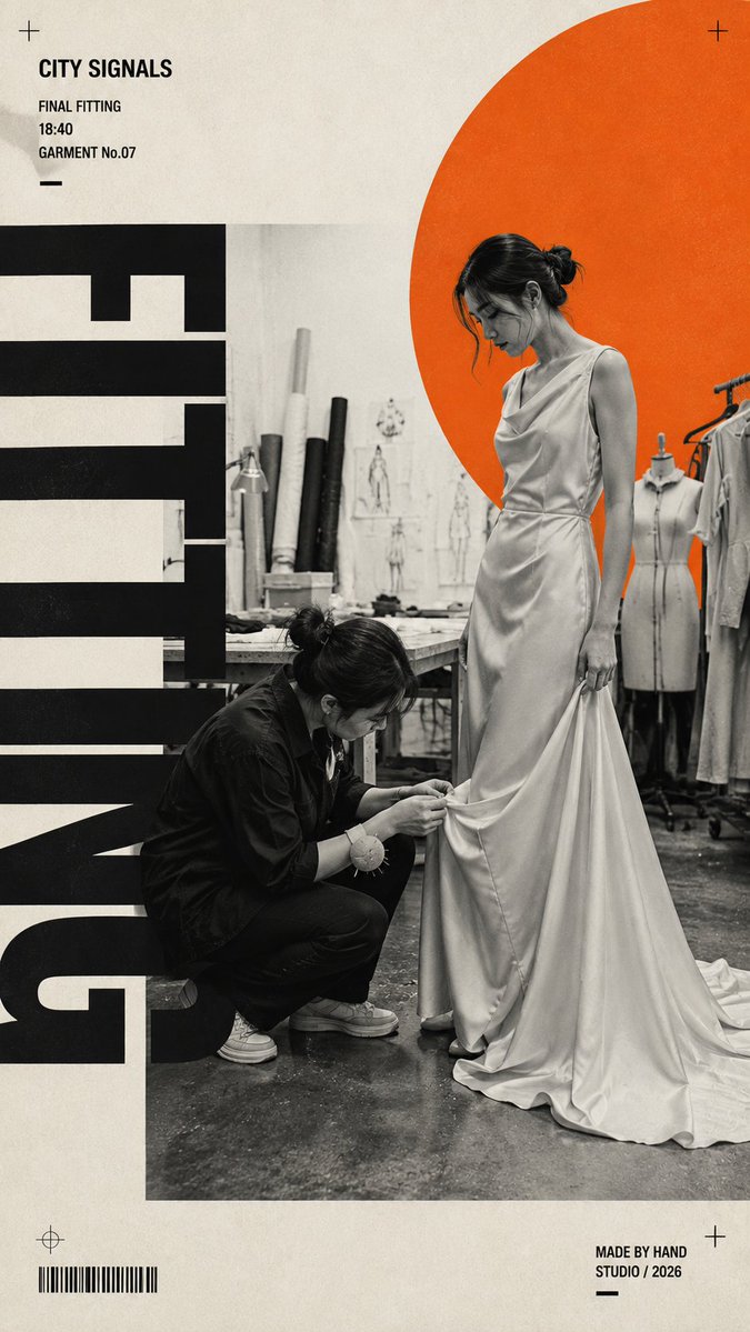
Create a 9:16 fashion editorial poster built around a real dressing-room moment. Scene: [Scene] Fashion action: [Fashion Action] Outfit: [Outfit] Accent color: [Accent Color] Headline: [Headline] Use realistic black-and-white documentary photography as the main visual. The model should be naturally interacting with the clothing — adjusting, changing, checking the fit, walking, or preparing to step out — not posing directly for the camera. Combine the monochrome photo with one single highly saturated accent color, warm off-white paper background, strong negative space, and oversized condensed sans-serif typography. Let the typography interact with the subject through cropping and layering, but keep all headline letters clean, solid, sharp, and fully rendered — no distressed, dirty, scratched, or broken text. Add only a few meaningful editorial details such as time, fitting-room status, look name, or a short phrase. Keep the layout bold, asymmetric, minimal, and fashion-magazine driven. Style: Swiss editorial design × brutalist typography × fashion documentary photography × modern print poster. Avoid multiple accent colors, random decorative text, excessive graphic symbols, messy typography, glossy commercial advertising, stiff model poses, CGI skin, and cluttered layouts.

Visual concept

Visual concept

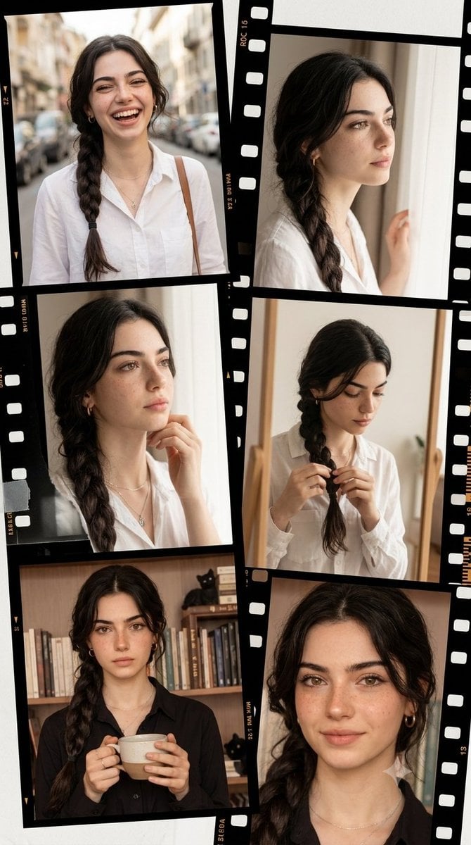
Vintage filmstrip collage of a woman Ultra-realistic IMAX-level Netflix-style asymmetrical film-style memory collage portrait, 9:16 vertical composition, use the uploaded reference image as the primary facial reference for the young woman with maximum face consistency and highest identity preservation, maintaining the exact facial identity, facial structure, eye shape, nose, lips, hairstyle influence, skin tone and overall appearance from the reference image, no facial changes, no age changes and no body distortion, a cool style fresh and realistic portrait photography collage designed like a rolling timeline of memories, composed of overlapping film frames, contact-sheet strips and transparent negatives arranged in an artistic asymmetrical layout, featuring the same young woman with luminous fair milky skin and ultra-smooth natural skin texture, her face showing a range of soft authentic emotions including joyful laughter while walking, a thoughtful and dreamy expression while looking out the window, quiet concentration while fixing her hair in the mirror, a calm cozy mood while holding a coffee, and a gentle natural smile in a candid close-up, her hairstyle preserved from the reference image with clean detailed strands and realistic texture across every frame, each panel feeling like a different personal memory captured across one beautiful visual story, clean and vibrant styling with youthful sweetness and energetic charm, soft and bright natural front lighting creating a diffused glow across her face and making the skin appear luminous and refined, ultra-rich color with creamy skin tones, fresh pastel highlights, soft daylight whites, clean neutrals and subtle warm accents creating a premium Korean editorial aesthetic, crisp facial features and sharp hair detail in every frame, realistic film-border details, subtle grain texture, slightly overlapping negative strips and scrapbook-like layering without looking messy, shallow depth of field, soft airy atmosphere, realistic reflections, storytelling composition, premium fashion-editorial mood, captured in the style of a full-frame camera with a 50mm prime lens, f/2.0, shutter speed 1/160s, ISO 100, single-point focus, photorealistic rendering, HDR, global illumination, super clear high-resolution finish, masterpiece quality, award-winning cinematography, 8K production detail. Negative Prompt: altered identity, different face, face swap errors, bad collage layout, blurry face, low-detail hair, bad anatomy, distorted hands, extra fingers, messy film frames, unreadable frame details, cartoon, anime, CGI look, low quality, text, watermark, logo.

Visual concept

Visual concept

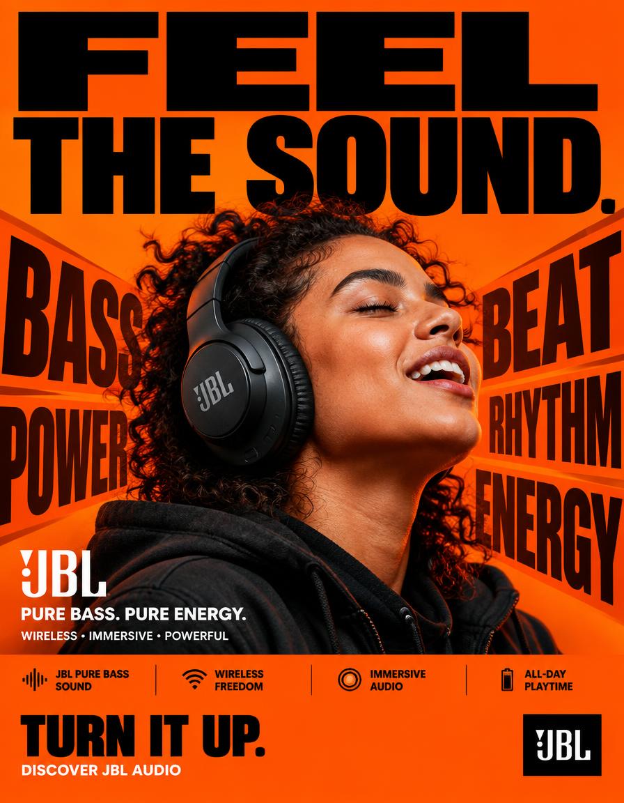
FORMAT: 4:5 vertical hyper-commercial JBL headphone campaign poster, ultra-high-resolution 8K, global OOH + Instagram + Meta advertising, BOLD TYPOGRAPHY–FIRST DESIGN, aggressive editorial graphic design, premium product photography, contemporary JBL advertising language ⸻ 🧠 CORE IDEA FEEL THE SOUND. Make typography the dominant visual element, with JBL’s signature orange brand color controlling the entire visual environment. The poster should communicate powerful JBL audio through a physical graphic metaphor: SOUND → IMPACT → MOVEMENT The typography appears to react to the sound, creating a visual sense of bass, rhythm and energy. ⸻ 🎬 MASTER COMPOSITION Create a highly graphic, typography-dominated composition. TOP 40% — TYPOGRAPHY DOMINATION Massive stacked headline: FEEL THE SOUND. Use extremely bold condensed sans-serif typography. The words should occupy almost the entire width of the poster. Aggressive scale. Some letters cropped by the edges. Typography should feel physically pushed by sound pressure. ⸻ 🟠 BRAND-COLOR BACKGROUND Use JBL’s signature orange as the dominant full-frame background. Strong, saturated JBL orange. Build subtle tonal variations within the orange rather than introducing unrelated background colors. Use: * Deep orange shadows * Bright orange highlights * Slight darker orange graphic blocks * Black typography * White microcopy The entire poster should immediately feel like JBL even before the logo is seen. ⸻ 🎧 PRODUCT + SUBJECT Place a realistic person wearing a JBL headphone prominently in the center/lower-middle section. The headphone must remain highly recognizable and physically accurate. Subject positioned directly within the typography composition. The person should feel energetic and immersed in the music. Natural expression. No exaggerated fashion pose. The headphone is the product hero. ⸻ 💥 TYPOGRAPHIC VISUAL METAPHOR Create oversized graphic words around the product: BASS BEAT POWER RHYTHM ENERGY These words should appear as huge background typography. Some letters can stretch, overlap and partially disappear behind the subject. Use typography to create the sensation of sound physically moving through the poster. Add subtle directional typographic distortion around the headphone. No literal sound waves. No futuristic holograms. ⸻ ✍️ TYPOGRAPHY SYSTEM Typography is the hero graphic element. PRIMARY HEADLINE FEEL THE SOUND. Extremely heavy bold grotesk / condensed sans-serif. Huge scale. Tight kerning. Strong black typography against JBL orange. SECONDARY COPY JBL PURE BASS. PURE ENERGY. MICROCOPY WIRELESS • IMMERSIVE • POWERFUL Small uppercase commercial typography. ⸻ 📦 FEATURE STRIP Bottom section contains a highly structured commercial information bar: JBL PURE BASS SOUND WIRELESS FREEDOM IMMERSIVE AUDIO ALL-DAY PLAYTIME Use compact uppercase typography separated by thin black rules. Keep the information visually organized and highly legible. ⸻ 📣 CTA Large bold CTA: TURN IT UP. Below: DISCOVER JBL AUDIO JBL logo positioned prominently but cleanly. ⸻ 🎨 COLOR SYSTEM PRIMARY: JBL signature orange. SECONDARY: Deep black. ACCENT: White. Orange must dominate the entire background. Black provides the major typography contrast. White is reserved for small supporting information and selected graphic details. No unnecessary blue, purple, cyan or neon gradients. ⸻ 💡 LIGHTING High-end commercial product photography. Strong directional studio lighting. Controlled highlights on the headphones. Natural skin texture. Subtle orange environmental bounce light. Deep controlled shadows. High contrast. The product must separate clearly from the orange background. ⸻ 🔍 HYPER DETAILING Ultra-realistic headphone materials: * precise matte and gloss surfaces * realistic ear cushions * detailed controls * subtle reflections * accurate JBL branding * realistic skin pores * natural clothing texture Typography must remain razor sharp and professionally typeset. ⸻ 📐 COMPOSITION FLOW 1. MASSIVE “FEEL THE SOUND.” HEADLINE ↓ 2. JBL ORANGE GRAPHIC FIELD ↓ 3. PRODUCT + HUMAN HERO ↓ 4. GIANT BASS / BEAT / POWER TYPOGRAPHY ↓ 5. PRODUCT NAME / BRANDING ↓ 6. FEATURE STRIP ↓ 7. CTA + JBL LOGO The concept must be understood within one second. ⸻ 🎥 CAMERA / RENDER Professional commercial photography. 50mm lens. Slightly low-angle perspective to give the product presence. Ultra-realistic 8K product detail. Sharp commercial focus. Clean edges. Print-quality typography. Premium global advertising execution. ⸻ 🚫 NEGATIVE DIRECTION No generic headphone advertisement. No blue background. No purple neon. No cyberpunk aesthetic. No holograms. No floating headphones. No random particles. No excessive lens flares. No fantasy environment. No excessive cinematic VFX. No tiny headline. No minimalist typography. No luxury-fashion-only aesthetic. No cluttered unreadable layout. No incorrect JBL logo. No distorted headphones. No fake product details. ⸻ 🔥 FINAL FEEL JBL × BOLD TYPOGRAPHY × ORANGE BRAND WORLD × PRODUCT PHOTOGRAPHY × SOUND ENERGY BIG TYPE. JBL ORANGE. REAL PRODUCT. PHYSICAL SOUND. MAXIMUM COMMERCIAL IMPACT.

Visual concept

Visual concept

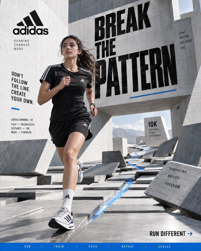
ADIDAS — “BREAK THE PATTERN” Format: Vertical 4:5 Social Hero Poster Style: Premium sports campaign × contemporary editorial photography × surreal architecture × bold graphic design Quality: Hyper-realistic, 8K, commercial campaign photography CORE IDEA Athletes spend years repeating the same movements until repetition becomes instinct. Instead of showing the athlete running through a normal environment, visualize routine breaking apart around them. Create a massive minimalist concrete training space where the floor is divided into hundreds of repeating geometric sections. As the athlete moves forward, those sections physically lift, rotate and rearrange into a new pathway. The world changes because the athlete refuses to follow the expected pattern. HERO ATHLETE Young professional female runner captured mid-stride. Natural athletic physique, realistic skin and subtle sweat, focused expression, loose hair reacting to movement. She wears: * Black adidas performance top * Black lightweight running shorts * White performance socks * Modern adidas running shoes with recognizable three-stripe detailing No exaggerated muscles or fashion-model posing. She should look like a real athlete captured during training. ENVIRONMENT Minimal white and concrete architectural space with enormous geometric walls and open negative space. Hundreds of rectangular floor panels create a precise grid. Some panels remain flat while others rise into ramps, walls and suspended pathways, creating a controlled impossible landscape. A thin blue accent line follows the athlete’s route through the environment. No random floating objects, fantasy scenery or psychedelic effects. COMPOSITION Keep the athlete as the visual anchor. Use the architectural grid to create strong leading lines toward her. Large portions of the poster remain clean and minimal, while selected sections contain oversized graphic elements, distance markers and cropped numbers. TYPOGRAPHY Large bold condensed typography integrated into the architecture: BREAK THE PATTERN Make PATTERN the dominant word. Supporting copy: DON’T FOLLOW THE LINE. CREATE YOUR OWN. Small technical elements: ADIDAS RUNNING / 01 PACE — PROGRESSIVE DISTANCE — 10K MODE — FORWARD Bottom CTA: RUN DIFFERENT → Add a thin blue horizontal strip: RUN / TRAIN / PUSH / REPEAT / EVOLVE PRODUCT The adidas running shoe should be highly realistic and naturally integrated into the action. Visible engineered mesh, stitching, outsole texture and realistic material deformation. The three-stripe branding should be clean and correctly proportioned without becoming oversized. LIGHTING & CAMERA Bright directional daylight entering from above, producing sharp architectural shadows and natural reflections. Professional sports photography, 50mm lens, slightly low camera position, fast shutter speed, realistic depth of field and subtle cinematic grain. Natural skin tones. Clean whites. Deep blacks. Controlled blue accent. FINAL LOOK The result should feel like a global adidas performance campaign photographed inside an impossible architectural training facility. Minimal, energetic, youthful and conceptual. No generic sneaker ad. No catalogue photography. No random AI surrealism. No excessive graphics. No luxury-fashion aesthetic. No fake CGI appearance. Vertical 4:5 · 8K UHD · hyper-realistic sports photography · surreal architecture · bold typography · premium adidas campaign · contemporary editorial art direction

Visual concept

Visual concept

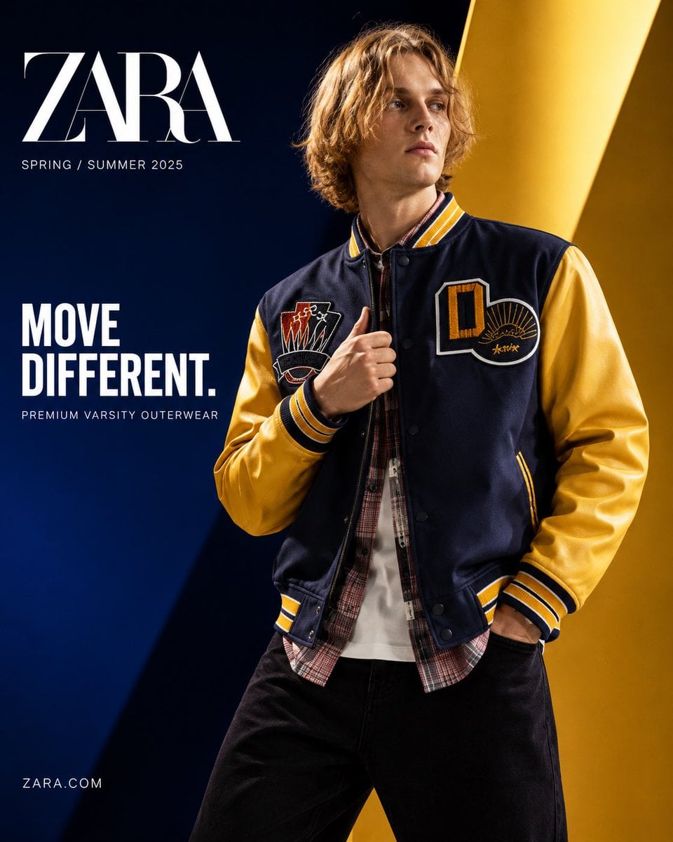
Act as a senior commercial fashion art director specializing in luxury apparel product advertising and premium social media campaigns. Create an ultra-premium product advertising poster for ZARA using the EXACT reference model and the EXACT varsity jacket from the uploaded image. REFERENCE LOCK (CRITICAL): Preserve the jacket exactly as shown: — deep navy wool body — varsity yellow sleeves — embroidered chest patches exactly matching reference — yellow/navy striped ribbed collar, cuffs, and hem — same stitching, buttons, silhouette, proportions, and construction Preserve model identity exactly: — same blonde medium-length messy hair — same facial bone structure — same skin tone — same slim body proportions Do not replace or redesign the model. IMAGE INTENT: A luxury Zara global campaign poster where the varsity jacket is the undisputed hero product. The image must feel like premium commercial advertising—not editorial fashion photography. FORMAT: Vertical 4:5 Luxury product SMM poster 8K ultra-detailed OBJECTIVE: Position Zara varsity outerwear as bold contemporary street luxury with premium aspirational appeal. VISUAL HIERARCHY: Jacket = 75% importance Model = 25% importance Viewer must notice jacket before face. ART DIRECTION: Bold luxury commercial design Minimal but powerful Graphic premium composition Global brand campaign quality Behance front-page quality No catalog energy POSE: Dynamic torso twist Shoulders rotated naturally Chest angled toward camera One hand gripping collar Other hand partially inside pocket Head slightly turned away Face de-emphasized Pose exists only to showcase garment structure and silhouette. COMPOSITION: Aggressive crop from waist upward Jacket dominates frame Strong asymmetrical balance Large negative space for typography Clean premium hierarchy BACKGROUND: Ultra-premium studio backdrop Large abstract geometric planes Oversized diagonal graphic blocks Minimal visual noise Strong architectural depth COLOR SYSTEM: Primary: Deep cobalt blue #0B2D89 Secondary: Rich varsity yellow #F3B51A Support: Pure white Rich black Soft metallic silver reflections Background colors should echo jacket palette. LIGHTING: High-end commercial product lighting Sharp rim light tracing jacket outline Hard specular highlights on sleeves Controlled glossy reflections Deep sculpted shadows Premium luxury contrast FABRIC DETAIL (MOST IMPORTANT): Ultra-detailed wool grain Visible embroidery threads Crisp ribbed knit texture Natural wrinkle compression at elbows Subtle cloth tension around buttons Luxury textile realism Materials must feel tactile and expensive TYPOGRAPHY SAFE ZONE: Reserve clean headline area. Typography: ZARA Headline: MOVE DIFFERENT. Sub-copy: PREMIUM VARSITY OUTERWEAR POST PROCESS: Luxury commercial retouch Micro contrast sharpening Gloss enhancement Subtle bloom Soft halation Fine film grain Print-ready finish QUALITY: Hyper-realistic Photorealistic Luxury product advertising Premium apparel campaign Global campaign quality 8K UHD NEGATIVE: no AI slop no distorted anatomy no extra fingers no altered patches no redesigned jacket no clutter no editorial portrait no weak product focus

En une phrase

Que vaut ce modèle ?

Mode d’exécution — La présentation officielle de ByteDance met notamment en avant l’édition multi-image, la conservation des détails des références, la mise en page et le rendu du texte. L’accès proposé par Kyeo a ses propres limites : prompt de 3 000 caractères au maximum, 8 formats et, pour une édition, jusqu’à 14 images JPG, PNG ou WebP de 10 Mo chacune.

Ses points forts
Seedream 4.5 / Accès — La présentation officielle de ByteDance met notamment en avant l’édition multi-image, la conservation des détails des références, la mise en page et le rendu du texte. L’accès proposé par Kyeo a ses propres limites : prompt de 3 000 caractères au maximum, 8 formats et, pour une édition, jusqu’à 14 images JPG, PNG ou WebP de 10 Mo chacune. Kyeo AI facture actuellement 7 crédits fixes par requête, au même tarif pour basic et high. Le budget réel dépend aussi du nombre de nouveaux essais, du taux de retouche et de la proportion de résultats finalement exploitables.
À qui s’adresse-t-il ?
À tester en priorité pour les compositions à plusieurs références, les retouches de produits ou de personnages, les affiches et les itérations à partir d’un visuel existant.
Pourquoi l’utiliser sur Kyeo AI ?
Seedream 4.5 / Fonctions — Le même espace de travail affiche les limites effectives — 7 crédits, 3 000 caractères, 8 formats et jusqu’à 14 images en édition — afin de comparer plusieurs modèles avec les mêmes ressources.

Paramètres essentiels

Évaluez rapidement si ce modèle convient à votre activité.

Catégorie
Modèle d’image par IA
Éditeur
ByteDance
Famille
Seedream
Accès
Disponible actuellement sur Kyeo AI
Mode d’exécution
Tâche asynchrone
Limite du prompt
3 000 caractères
Limite d’import
Jusqu’à 14 images en édition

Autres noms

Un même modèle peut porter des noms différents dans la documentation officielle, les discussions de la communauté et les interfaces d’intégration. Ils sont regroupés ici.

Seedream 4.5
doubao-seedream-4.5

Questions fréquentes des utilisateurs

Ces questions pratiques portent sur la tâche, les entrées et le résultat à confirmer avant de choisir.

comment utiliser Seedream 4.5 sur Kyeo AI
combien de crédits consomme Seedream 4.5 par requête
quels paramètres peut-on régler avec Seedream 4.5
comment configurer la génération texte vers image avec Seedream 4.5
comment modifier une image de référence avec Seedream 4.5
que signifie le paramètre quality de Seedream 4.5
comment choisir entre basic et high avec Seedream 4.5
choisir 2K ou 4K avec Seedream 4.5
différences entre Seedream 4.5 et Seedream 4.0
différences entre Seedream 4.5 et Seedream 5.0 Lite

Guide de choix

Pour choisir entre plusieurs modèles, commencez par ces critères essentiels.

1
Commencer par un essai pour les éditions multi-images

Commencer par un essai pour les éditions multi-images — Si la tâche combine plusieurs références de produits, de personnages ou de styles, commencez par un petit échantillon avec Seedream 4.5. Quatorze images constituent la limite de l’interface, pas une quantité recommandée.

2
Comparer d’autres versions si le coût ou les réglages conviennent mal

Comparer d’autres versions si le coût ou les réglages conviennent mal — Pour choisir explicitement entre 1K, 2K et 4K, comparez avec Seedream 4.0. Pour évaluer un tarif fixe inférieur sur le site et des niveaux 2K/3K, ajoutez Seedream 5.0 Lite au test.

3
Valider le 2K et le 4K avec les mêmes ressources

Valider le 2K et le 4K avec les mêmes ressources — Conservez le même prompt et les mêmes références, puis exécutez `basic` et `high` pour comparer les détails, le texte, la conservation du sujet et les dimensions exploitables. Les deux niveaux coûtent 7 crédits : la mention 4K ne suffit pas pour juger la qualité.

Comparaisons souvent recherchées

Comparez des alternatives courantes sur une même tâche pour clarifier les différences d’entrées, de contrôle et de coût.

différences entre Seedream 4.5 et Nano Banana Pro
Seedream 4.5 vs Nano Banana Pro
différences entre Seedream 4.5 et Flux 2 Pro
Seedream 4.5 vs Flux 2 Pro
différences entre Seedream 4.5 et GPT Image 1.5
Seedream 4.5 vs GPT Image 1.5

Tableau comparatif

Vous hésitez encore ? Ce tableau met en évidence les principales différences entre ce modèle et ses alternatives.

Périmètre du workflow
Seedream 4.5
Texte vers image + édition d’images
Seedream 5 Lite
Périmètre du workflow — Seedream 5 Lite: Une alternative actuellement disponible dans la même catégorie ; ouvrez sa fiche pour comparer les fonctions et les tarifs.
Spécifications de sortie
Seedream 4.5
basic 2K / high 4K
Seedream 5 Lite
Spécifications de sortie — Seedream 5 Lite: Une alternative actuellement disponible dans la même catégorie ; ouvrez sa fiche pour comparer les fonctions et les tarifs.
Limite du prompt
Seedream 4.5
3 000 caractères
Seedream 5 Lite
Limite du prompt — Seedream 5 Lite: Une alternative actuellement disponible dans la même catégorie ; ouvrez sa fiche pour comparer les fonctions et les tarifs.
Tarif
Seedream 4.5
7 crédits / génération
Seedream 5 Lite
Tarif — Seedream 5 Lite: Une alternative actuellement disponible dans la même catégorie ; ouvrez sa fiche pour comparer les fonctions et les tarifs.
Critère de choix
Seedream 4.5
À tester pour une sortie 2K/4K ou une édition multi-image
Seedream 5 Lite
Critère de choix — Seedream 5 Lite: Une alternative actuellement disponible dans la même catégorie ; ouvrez sa fiche pour comparer les fonctions et les tarifs.

Retour d’usage

Des conseils pratiques fondés sur les sources publiques, les limites actuelles du site et des tâches représentatives.

Qualité

Seedream 4.5 / Qualité — Conservez le même prompt et les mêmes références, puis exécutez `basic` et `high` pour comparer les détails, le texte, la conservation du sujet et les dimensions exploitables. Les deux niveaux coûtent 7 crédits : la mention 4K ne suffit pas pour juger la qualité.

Les démonstrations officielles indiquent une orientation, sans constituer une garantie

Seedream 4.5 / Les démonstrations officielles indiquent une orientation, sans constituer une garantie — Pour un usage réel, évaluez le taux de résultats exploitables avec vos propres ressources, vos textes et vos critères de validation.

Fonctions en détail

Fonctions

Fonctions — La présentation officielle de ByteDance met notamment en avant l’édition multi-image, la conservation des détails des références, la mise en page et le rendu du texte. L’accès proposé par Kyeo a ses propres limites : prompt de 3 000 caractères au maximum, 8 formats et, pour une édition, jusqu’à 14 images JPG, PNG ou WebP de 10 Mo chacune.

8 formats et deux niveaux de sortie

8 formats et deux niveaux de sortie — L’espace de travail propose les formats 1:1, 4:3, 3:4, 16:9, 9:16, 2:3, 3:2 et 21:9, avec une sortie basic 2K ou high 4K. Chaque requête coûte actuellement 7 crédits.

Limites des références et du prompt

Limites des références et du prompt — Le prompt est limité à 3 000 caractères. L’interface d’édition accepte jusqu’à 14 références JPG, PNG ou WebP de 10 Mo chacune ; la génération à partir de texte ne nécessite aucune image.

Usages adaptés

Composition et modification à partir de plusieurs références

Réunissez des références de personnages, de produits, de vêtements ou de styles dans une même édition, en précisant le rôle de chaque image et les éléments à conserver.

Affiches et visuels contenant du texte

Générez une série d’images sur un même thème pour préparer des déclinaisons destinées aux réseaux sociaux ou à une campagne.

Variantes de visuels produits et de campagne

Modifiez le fond, la matière ou la composition d’un visuel existant, puis vérifiez manuellement l’apparence du produit, les marques et les informations essentielles.

Conseils de prompt

Préciser ce qui doit être conservé ou modifié

Pour chaque référence, indiquez les informations qu’elle apporte, puis ce qui doit rester ou peut changer dans le sujet, la pose, les couleurs, les matières et l’arrière-plan.

Écrire exactement le texte à afficher

Pour une affiche ou un visuel produit, fournissez le texte exact, sa langue, sa hiérarchie et son emplacement.

Commencer avec peu de références

Quatorze images ne sont que la limite de l’interface d’édition. Utilisez d’abord le minimum nécessaire, puis réduisez les ressources et les contraintes si les sujets se mélangent ou si les styles entrent en conflit.

Pourquoi le choisir ?

Une même entrée Kyeo couvre la génération à partir de texte et l’édition par références.
La page officielle de ByteDance présente clairement l’édition multi-image, la conservation des détails, la mise en page et le rendu du texte.
Le site propose 8 formats et deux niveaux de sortie, 2K et 4K.
Le tarif fixe de 7 crédits par requête facilite l’estimation du coût selon le nombre d’essais.

À savoir avant de l’utiliser

Pour un workflow durable, conservez un échantillon fixe afin de revérifier la composition, le texte et la cohérence du style après une mise à jour.
Commencez par générer un échantillon représentatif avec les paramètres retenus, puis augmentez le volume uniquement si le résultat répond à l’objectif.
Un rendu artistique très stylisé peut nécessiter des essais croisés avec d’autres familles de modèles.
Le texte généré, les détails des produits, les marques et tout contenu juridiquement sensible doivent être vérifiés manuellement.

Paramètres réglables

Évaluez rapidement si ce modèle convient à votre activité.

Format
Facultatif
Type de paramètre: select
Par défaut : 1:1
1:1
4:3
3:4
16:9
9:16
2:3
8 options
Qualité
Facultatif
Type de paramètre: select
Par défaut : basic
Standard (2K)
Haute définition (4K)

Coût en crédits

7 crédits / génération

Kyeo AI facture actuellement 7 crédits fixes par requête, au même tarif pour basic et high. Le budget réel dépend aussi du nombre de nouveaux essais, du taux de retouche et de la proportion de résultats finalement exploitables.

Conseil pour économiser des crédits

Avant de générer une série d’images ou de vidéos, effectuez un test A/B avec les mêmes médias sur ce modèle et des modèles similaires. Lancez la série après avoir validé le résultat pour éviter de gaspiller des crédits.

Questions fréquentes

Modèles similaires

Vous hésitez encore ? Comparez aussi ces modèles similaires.

Nano Banana Pro

Sur Kyeo AI, Nano Banana Pro prend en charge la génération à partir de texte et l’édition par images de référence, avec des sorties en 1K, 2K ou 4K. Le 1K et le 2K coûtent 8 crédits par génération, contre 14 pour le 4K. La résolution indique une taille de sortie, sans garantir la qualité, l’exactitude ni le niveau de détail.

Modèle IA de génération et d’édition d’images
8 à 14 crédits / génération

Flux 2 Pro

Flux 2 Pro / Fonctions — Flux 2 Pro — Le texte vers image et l’édition sont facturés selon la résolution : 5 crédits en 1K et 7 crédits en 2K. 3–5 000 caractères; 8 images.

Modèle d’image par IA
5 à 7 crédits / requête

GPT Image 1.5

Sur Kyeo, GPT Image 1.5 prend en charge la génération à partir de texte et l’édition d’images, avec 3 formats et les niveaux de qualité medium/high. Le chemin image vers image accepte jusqu’à 16 références JPG, PNG ou WebP, limitées à 10 Mo chacune. Le niveau medium coûte 4 crédits et le niveau high 22 crédits. GPT Image 1.5 est un modèle d’image de génération précédente qu’OpenAI a abandonné. Kyeo conserve ses accès de génération et d’édition, sans que cela signifie qu’OpenAI le recommande encore par défaut.

Modèle d’image par IA
4 à 22 crédits / génération

Sources

Le contenu de cette page est établi à partir des informations de l’éditeur, de la documentation sur la famille du modèle et de la configuration d’intégration de Kyeo AI.

Note sur les sources

La présentation officielle de ByteDance met notamment en avant l’édition multi-image, la conservation des détails des références, la mise en page et le rendu du texte. L’accès proposé par Kyeo a ses propres limites : prompt de 3 000 caractères au maximum, 8 formats et, pour une édition, jusqu’à 14 images JPG, PNG ou WebP de 10 Mo chacune.

Dernière mise à jour: 2026-08-26
ByteDance Seed : Seedream 4.5
Officiel
Consulter la source d’origine
Volcengine : génération et édition d’images avec la gamme Seedream
Officiel
Consulter la source d’origine