メインコンテンツへ移動
AI画像モデル
ByteDance
Seedream

Seedream 4.5

Seedream 4.5 / 機能 — ByteDance公式の紹介は、Seedream 4.5の複数画像編集、参照画像の細部維持、レイアウト、文字表現を重点的に示しています。Kyeoの実際の入口には明確な範囲があり、プロンプトは3,000文字まで、8種類のアスペクト比を提供し、編集タスクはJPG、PNG、WebPを最大14枚、1枚10 MBまで受け付けます。 Kyeo AIでは現在、リクエスト1回につき7クレジット固定で、basicとhighは同額です。実際の予算には、再試行回数、手直し率、最終的に使える結果の割合も含めてください。

機能
テキスト画像生成、画像編集
クレジット消費
7クレジット/回
プロンプト上限
3,000文字
アップロード上限
編集時は画像最大14枚
30秒でわかる
  • Seedream 4.5 / 機能 — ByteDance公式は複数画像編集、参照画像の細部維持、文字表現を重点的に紹介
  • Seedream 4.5 / 連携方式 — Kyeoの同じ入口でテキスト画像生成と参照画像編集に対応
  • Seedream 4.5 / クレジット消費 — Kyeo AIでは現在、リクエスト1回につき7クレジット固定で、basicとhighは同額です。実際の予算には、再試行回数、手直し率、最終的に使える結果の割合も含めてください。
  • Seedream 4.5 / アスペクト比 / 品質 — 8種類のアスペクト比とbasic 2K/high 4Kを選択可能

よく検索されるキーワード: Kyeo AIでSeedream 4.5を使う方法 · Seedream 4.5は1回何クレジットか · Seedream 4.5で変更できる設定

例

Visual concept

Visual concept

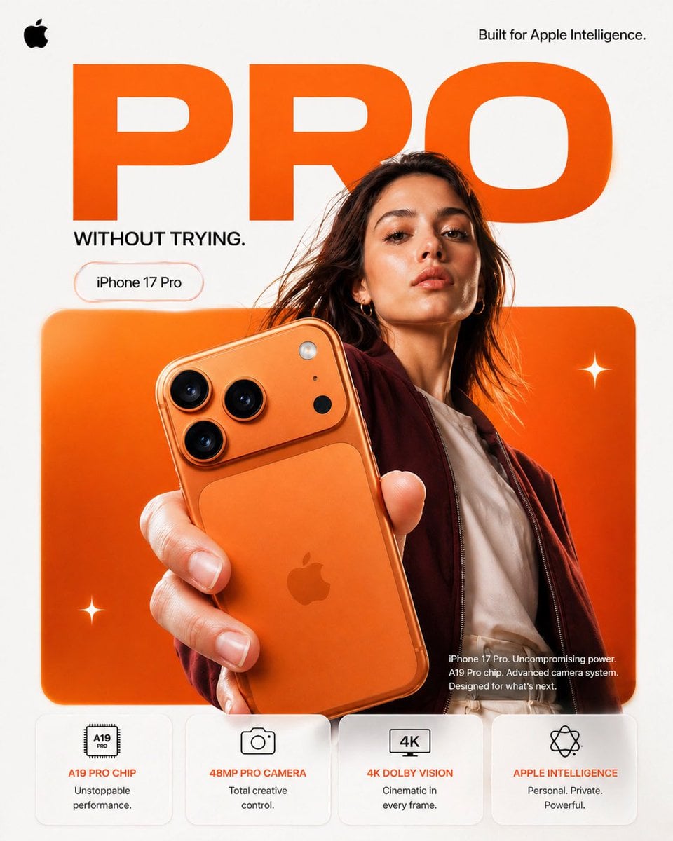
FORMAT: 4:5 vertical premium smartphone campaign poster, ultra-high resolution (8K), global OOH + digital + social ready Style: Apple-level minimalism × bold Gen-Z composition × hyper-real commercial photography 🧠 CORE INTENT: “PRO, WITHOUT TRYING.” Effortless power. Quiet confidence. No noise — just precision. 🎬 SCENE COMPOSITION: BACKGROUND: Pure matte white canvas with a dominant rounded rectangle block in ultra-vibrant burnt orange gradient (top-left → bottom-right glow) GIANT TYPOGRAPHY (BACKGROUND LAYER): “PRO” - ultra-bold geometric sans-serif - stretched wide kerning - partially cropped by frame edges - soft shadow depth - color: deep orange slightly darker than background block - subtle emboss effect 👤 SUBJECT (HUMAN ELEMENT): - Female model, clean editorial look (Apple casting style) - Neutral expression (confident, calm, not smiling) - Hair: natural flow, slightly wind-touched - Outfit: → muted tones (off-white + deep maroon jacket) → minimal styling, no distractions POSE: - Shot from slightly low angle (hero perspective) - One hand extended toward camera holding iPhone - Body slightly angled for depth - Face aligned toward viewer (eye contact) 📱 PRODUCT (HERO FOCUS): DEVICE: iPhone 17 Pro in Titanium Orange finish POSITION: - Extreme foreground (forced perspective) - Slight tilt to reveal camera module depth DETAILING: - triple camera system hyper-sharp - lens reflections physically accurate - brushed titanium edge highlights - micro-scratches + realistic material response - Apple logo centered, subtle reflective gloss REFLECTION: - soft studio reflection on device edges - micro light bloom around camera rings ✨ LIGHTING SYSTEM: MAIN LIGHT: Soft studio key light (front-left) → smooth skin tones → clean product highlights RIM LIGHT: Warm edge light from right → enhances phone silhouette → highlights metallic edges ACCENT LIGHT: Subtle glow from background orange block SHADOW: Soft drop shadow under subject + phone (no harsh contrast) 🎨 COLOR SYSTEM: - Primary: Apple Orange (hero) - Secondary: Clean white - Accent: warm highlights + skin tones - Contrast: deep micro-shadows No over-saturation. No neon. Controlled premium palette. ✨ GRAPHIC ELEMENTS: - Minimal sparkle icons ✦ (2–3 only) - Soft floating UI pill (glass morphism) - Very subtle grain for realism ✍️ TYPOGRAPHY SYSTEM: TOP LEFT: Apple logo (black, small, clean) TOP RIGHT: “Built for Apple Intelligence.” (thin sans-serif) MID LEFT (pill): “iPhone 17 Pro” CENTER DOMINANT: “PRO” (background type) BOTTOM RIGHT (body text): Small paragraph: “iPhone 17 Pro. Uncompromising power. A19 Pro chip. Advanced camera system. Designed for what’s next.” 📊 FEATURE STRIP (BOTTOM GRID): 4 rounded cards (glass-white panels): 1. A19 PRO CHIP “Unstoppable performance.” 2. 48MP PRO CAMERA “Total creative control.” 3. 4K DOLBY VISION “Cinematic in every frame.” 4. APPLE INTELLIGENCE “Personal. Private. Powerful.” Icons minimal line style 📐 COMPOSITION GRID: - Top: brand + statement - Mid: subject + product (dominant) - Background: typography layer - Bottom: feature modules Eye flow: Face → Phone → Camera → “PRO” → Features 🎥 CAMERA SPECS: - ARRI Alexa Mini LF - 50mm anamorphic lens - shallow depth of field - HDR rendering - ultra-real skin + material detail - slight lens distortion for realism
Visual concept

Visual concept

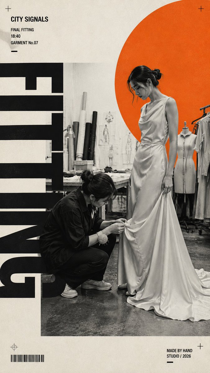
Create a 9:16 fashion editorial poster built around a real dressing-room moment. Scene: [Scene] Fashion action: [Fashion Action] Outfit: [Outfit] Accent color: [Accent Color] Headline: [Headline] Use realistic black-and-white documentary photography as the main visual. The model should be naturally interacting with the clothing — adjusting, changing, checking the fit, walking, or preparing to step out — not posing directly for the camera. Combine the monochrome photo with one single highly saturated accent color, warm off-white paper background, strong negative space, and oversized condensed sans-serif typography. Let the typography interact with the subject through cropping and layering, but keep all headline letters clean, solid, sharp, and fully rendered — no distressed, dirty, scratched, or broken text. Add only a few meaningful editorial details such as time, fitting-room status, look name, or a short phrase. Keep the layout bold, asymmetric, minimal, and fashion-magazine driven. Style: Swiss editorial design × brutalist typography × fashion documentary photography × modern print poster. Avoid multiple accent colors, random decorative text, excessive graphic symbols, messy typography, glossy commercial advertising, stiff model poses, CGI skin, and cluttered layouts.

Visual concept

Visual concept

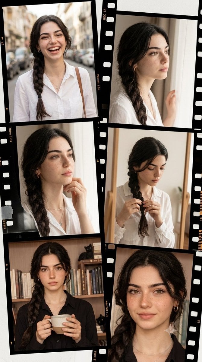
Vintage filmstrip collage of a woman Ultra-realistic IMAX-level Netflix-style asymmetrical film-style memory collage portrait, 9:16 vertical composition, use the uploaded reference image as the primary facial reference for the young woman with maximum face consistency and highest identity preservation, maintaining the exact facial identity, facial structure, eye shape, nose, lips, hairstyle influence, skin tone and overall appearance from the reference image, no facial changes, no age changes and no body distortion, a cool style fresh and realistic portrait photography collage designed like a rolling timeline of memories, composed of overlapping film frames, contact-sheet strips and transparent negatives arranged in an artistic asymmetrical layout, featuring the same young woman with luminous fair milky skin and ultra-smooth natural skin texture, her face showing a range of soft authentic emotions including joyful laughter while walking, a thoughtful and dreamy expression while looking out the window, quiet concentration while fixing her hair in the mirror, a calm cozy mood while holding a coffee, and a gentle natural smile in a candid close-up, her hairstyle preserved from the reference image with clean detailed strands and realistic texture across every frame, each panel feeling like a different personal memory captured across one beautiful visual story, clean and vibrant styling with youthful sweetness and energetic charm, soft and bright natural front lighting creating a diffused glow across her face and making the skin appear luminous and refined, ultra-rich color with creamy skin tones, fresh pastel highlights, soft daylight whites, clean neutrals and subtle warm accents creating a premium Korean editorial aesthetic, crisp facial features and sharp hair detail in every frame, realistic film-border details, subtle grain texture, slightly overlapping negative strips and scrapbook-like layering without looking messy, shallow depth of field, soft airy atmosphere, realistic reflections, storytelling composition, premium fashion-editorial mood, captured in the style of a full-frame camera with a 50mm prime lens, f/2.0, shutter speed 1/160s, ISO 100, single-point focus, photorealistic rendering, HDR, global illumination, super clear high-resolution finish, masterpiece quality, award-winning cinematography, 8K production detail. Negative Prompt: altered identity, different face, face swap errors, bad collage layout, blurry face, low-detail hair, bad anatomy, distorted hands, extra fingers, messy film frames, unreadable frame details, cartoon, anime, CGI look, low quality, text, watermark, logo.

Visual concept

Visual concept

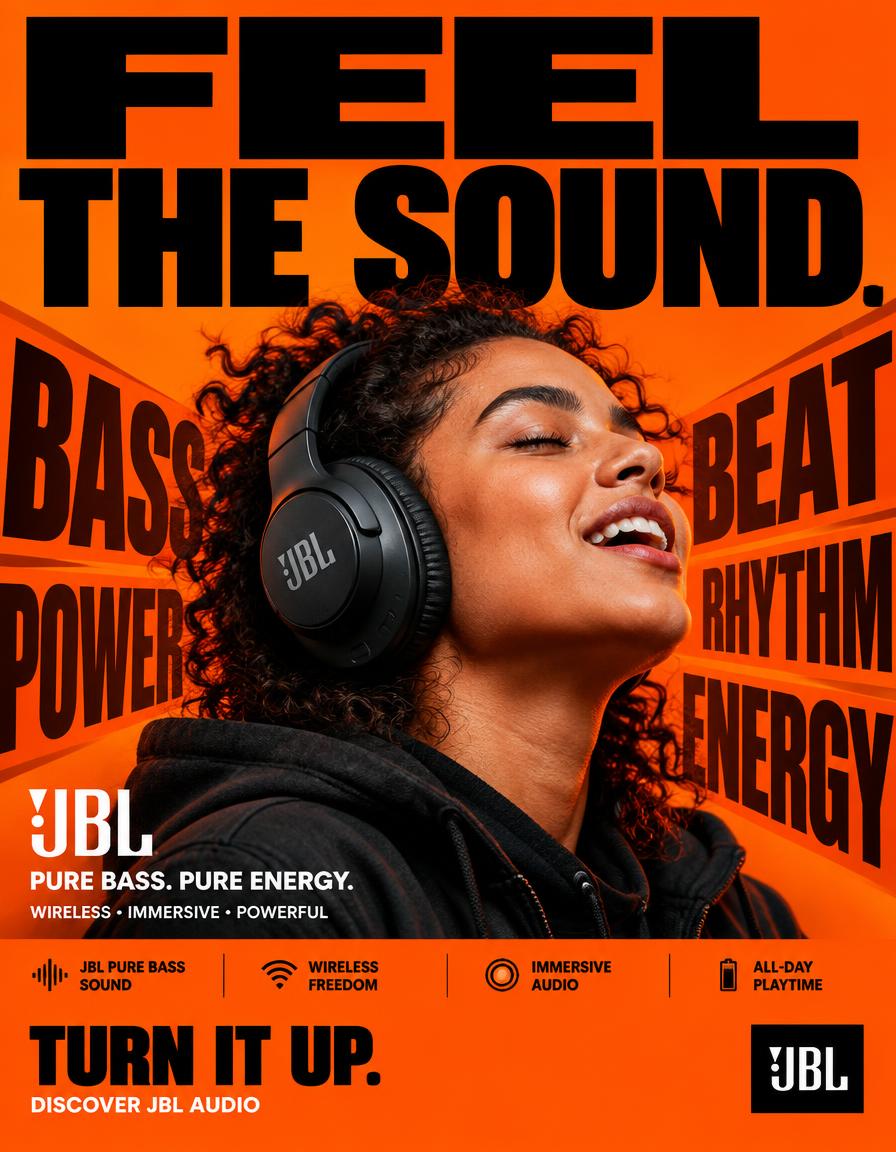
FORMAT: 4:5 vertical hyper-commercial JBL headphone campaign poster, ultra-high-resolution 8K, global OOH + Instagram + Meta advertising, BOLD TYPOGRAPHY–FIRST DESIGN, aggressive editorial graphic design, premium product photography, contemporary JBL advertising language ⸻ 🧠 CORE IDEA FEEL THE SOUND. Make typography the dominant visual element, with JBL’s signature orange brand color controlling the entire visual environment. The poster should communicate powerful JBL audio through a physical graphic metaphor: SOUND → IMPACT → MOVEMENT The typography appears to react to the sound, creating a visual sense of bass, rhythm and energy. ⸻ 🎬 MASTER COMPOSITION Create a highly graphic, typography-dominated composition. TOP 40% — TYPOGRAPHY DOMINATION Massive stacked headline: FEEL THE SOUND. Use extremely bold condensed sans-serif typography. The words should occupy almost the entire width of the poster. Aggressive scale. Some letters cropped by the edges. Typography should feel physically pushed by sound pressure. ⸻ 🟠 BRAND-COLOR BACKGROUND Use JBL’s signature orange as the dominant full-frame background. Strong, saturated JBL orange. Build subtle tonal variations within the orange rather than introducing unrelated background colors. Use: * Deep orange shadows * Bright orange highlights * Slight darker orange graphic blocks * Black typography * White microcopy The entire poster should immediately feel like JBL even before the logo is seen. ⸻ 🎧 PRODUCT + SUBJECT Place a realistic person wearing a JBL headphone prominently in the center/lower-middle section. The headphone must remain highly recognizable and physically accurate. Subject positioned directly within the typography composition. The person should feel energetic and immersed in the music. Natural expression. No exaggerated fashion pose. The headphone is the product hero. ⸻ 💥 TYPOGRAPHIC VISUAL METAPHOR Create oversized graphic words around the product: BASS BEAT POWER RHYTHM ENERGY These words should appear as huge background typography. Some letters can stretch, overlap and partially disappear behind the subject. Use typography to create the sensation of sound physically moving through the poster. Add subtle directional typographic distortion around the headphone. No literal sound waves. No futuristic holograms. ⸻ ✍️ TYPOGRAPHY SYSTEM Typography is the hero graphic element. PRIMARY HEADLINE FEEL THE SOUND. Extremely heavy bold grotesk / condensed sans-serif. Huge scale. Tight kerning. Strong black typography against JBL orange. SECONDARY COPY JBL PURE BASS. PURE ENERGY. MICROCOPY WIRELESS • IMMERSIVE • POWERFUL Small uppercase commercial typography. ⸻ 📦 FEATURE STRIP Bottom section contains a highly structured commercial information bar: JBL PURE BASS SOUND WIRELESS FREEDOM IMMERSIVE AUDIO ALL-DAY PLAYTIME Use compact uppercase typography separated by thin black rules. Keep the information visually organized and highly legible. ⸻ 📣 CTA Large bold CTA: TURN IT UP. Below: DISCOVER JBL AUDIO JBL logo positioned prominently but cleanly. ⸻ 🎨 COLOR SYSTEM PRIMARY: JBL signature orange. SECONDARY: Deep black. ACCENT: White. Orange must dominate the entire background. Black provides the major typography contrast. White is reserved for small supporting information and selected graphic details. No unnecessary blue, purple, cyan or neon gradients. ⸻ 💡 LIGHTING High-end commercial product photography. Strong directional studio lighting. Controlled highlights on the headphones. Natural skin texture. Subtle orange environmental bounce light. Deep controlled shadows. High contrast. The product must separate clearly from the orange background. ⸻ 🔍 HYPER DETAILING Ultra-realistic headphone materials: * precise matte and gloss surfaces * realistic ear cushions * detailed controls * subtle reflections * accurate JBL branding * realistic skin pores * natural clothing texture Typography must remain razor sharp and professionally typeset. ⸻ 📐 COMPOSITION FLOW 1. MASSIVE “FEEL THE SOUND.” HEADLINE ↓ 2. JBL ORANGE GRAPHIC FIELD ↓ 3. PRODUCT + HUMAN HERO ↓ 4. GIANT BASS / BEAT / POWER TYPOGRAPHY ↓ 5. PRODUCT NAME / BRANDING ↓ 6. FEATURE STRIP ↓ 7. CTA + JBL LOGO The concept must be understood within one second. ⸻ 🎥 CAMERA / RENDER Professional commercial photography. 50mm lens. Slightly low-angle perspective to give the product presence. Ultra-realistic 8K product detail. Sharp commercial focus. Clean edges. Print-quality typography. Premium global advertising execution. ⸻ 🚫 NEGATIVE DIRECTION No generic headphone advertisement. No blue background. No purple neon. No cyberpunk aesthetic. No holograms. No floating headphones. No random particles. No excessive lens flares. No fantasy environment. No excessive cinematic VFX. No tiny headline. No minimalist typography. No luxury-fashion-only aesthetic. No cluttered unreadable layout. No incorrect JBL logo. No distorted headphones. No fake product details. ⸻ 🔥 FINAL FEEL JBL × BOLD TYPOGRAPHY × ORANGE BRAND WORLD × PRODUCT PHOTOGRAPHY × SOUND ENERGY BIG TYPE. JBL ORANGE. REAL PRODUCT. PHYSICAL SOUND. MAXIMUM COMMERCIAL IMPACT.

Visual concept

Visual concept

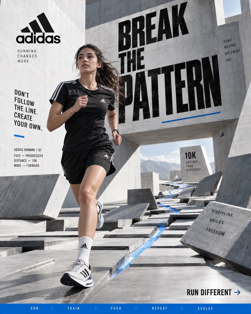
ADIDAS — “BREAK THE PATTERN” Format: Vertical 4:5 Social Hero Poster Style: Premium sports campaign × contemporary editorial photography × surreal architecture × bold graphic design Quality: Hyper-realistic, 8K, commercial campaign photography CORE IDEA Athletes spend years repeating the same movements until repetition becomes instinct. Instead of showing the athlete running through a normal environment, visualize routine breaking apart around them. Create a massive minimalist concrete training space where the floor is divided into hundreds of repeating geometric sections. As the athlete moves forward, those sections physically lift, rotate and rearrange into a new pathway. The world changes because the athlete refuses to follow the expected pattern. HERO ATHLETE Young professional female runner captured mid-stride. Natural athletic physique, realistic skin and subtle sweat, focused expression, loose hair reacting to movement. She wears: * Black adidas performance top * Black lightweight running shorts * White performance socks * Modern adidas running shoes with recognizable three-stripe detailing No exaggerated muscles or fashion-model posing. She should look like a real athlete captured during training. ENVIRONMENT Minimal white and concrete architectural space with enormous geometric walls and open negative space. Hundreds of rectangular floor panels create a precise grid. Some panels remain flat while others rise into ramps, walls and suspended pathways, creating a controlled impossible landscape. A thin blue accent line follows the athlete’s route through the environment. No random floating objects, fantasy scenery or psychedelic effects. COMPOSITION Keep the athlete as the visual anchor. Use the architectural grid to create strong leading lines toward her. Large portions of the poster remain clean and minimal, while selected sections contain oversized graphic elements, distance markers and cropped numbers. TYPOGRAPHY Large bold condensed typography integrated into the architecture: BREAK THE PATTERN Make PATTERN the dominant word. Supporting copy: DON’T FOLLOW THE LINE. CREATE YOUR OWN. Small technical elements: ADIDAS RUNNING / 01 PACE — PROGRESSIVE DISTANCE — 10K MODE — FORWARD Bottom CTA: RUN DIFFERENT → Add a thin blue horizontal strip: RUN / TRAIN / PUSH / REPEAT / EVOLVE PRODUCT The adidas running shoe should be highly realistic and naturally integrated into the action. Visible engineered mesh, stitching, outsole texture and realistic material deformation. The three-stripe branding should be clean and correctly proportioned without becoming oversized. LIGHTING & CAMERA Bright directional daylight entering from above, producing sharp architectural shadows and natural reflections. Professional sports photography, 50mm lens, slightly low camera position, fast shutter speed, realistic depth of field and subtle cinematic grain. Natural skin tones. Clean whites. Deep blacks. Controlled blue accent. FINAL LOOK The result should feel like a global adidas performance campaign photographed inside an impossible architectural training facility. Minimal, energetic, youthful and conceptual. No generic sneaker ad. No catalogue photography. No random AI surrealism. No excessive graphics. No luxury-fashion aesthetic. No fake CGI appearance. Vertical 4:5 · 8K UHD · hyper-realistic sports photography · surreal architecture · bold typography · premium adidas campaign · contemporary editorial art direction

Visual concept

Visual concept

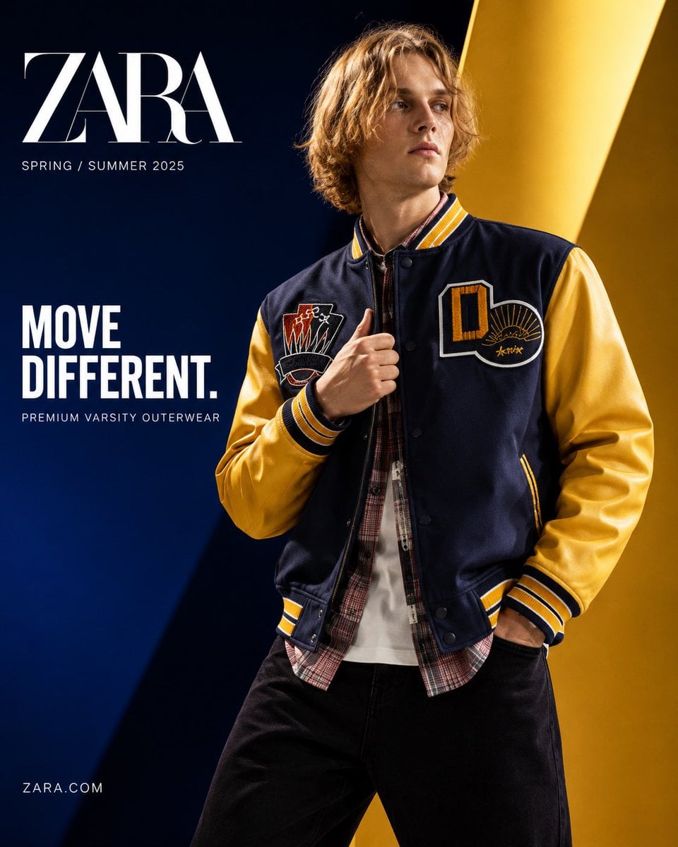
Act as a senior commercial fashion art director specializing in luxury apparel product advertising and premium social media campaigns. Create an ultra-premium product advertising poster for ZARA using the EXACT reference model and the EXACT varsity jacket from the uploaded image. REFERENCE LOCK (CRITICAL): Preserve the jacket exactly as shown: — deep navy wool body — varsity yellow sleeves — embroidered chest patches exactly matching reference — yellow/navy striped ribbed collar, cuffs, and hem — same stitching, buttons, silhouette, proportions, and construction Preserve model identity exactly: — same blonde medium-length messy hair — same facial bone structure — same skin tone — same slim body proportions Do not replace or redesign the model. IMAGE INTENT: A luxury Zara global campaign poster where the varsity jacket is the undisputed hero product. The image must feel like premium commercial advertising—not editorial fashion photography. FORMAT: Vertical 4:5 Luxury product SMM poster 8K ultra-detailed OBJECTIVE: Position Zara varsity outerwear as bold contemporary street luxury with premium aspirational appeal. VISUAL HIERARCHY: Jacket = 75% importance Model = 25% importance Viewer must notice jacket before face. ART DIRECTION: Bold luxury commercial design Minimal but powerful Graphic premium composition Global brand campaign quality Behance front-page quality No catalog energy POSE: Dynamic torso twist Shoulders rotated naturally Chest angled toward camera One hand gripping collar Other hand partially inside pocket Head slightly turned away Face de-emphasized Pose exists only to showcase garment structure and silhouette. COMPOSITION: Aggressive crop from waist upward Jacket dominates frame Strong asymmetrical balance Large negative space for typography Clean premium hierarchy BACKGROUND: Ultra-premium studio backdrop Large abstract geometric planes Oversized diagonal graphic blocks Minimal visual noise Strong architectural depth COLOR SYSTEM: Primary: Deep cobalt blue #0B2D89 Secondary: Rich varsity yellow #F3B51A Support: Pure white Rich black Soft metallic silver reflections Background colors should echo jacket palette. LIGHTING: High-end commercial product lighting Sharp rim light tracing jacket outline Hard specular highlights on sleeves Controlled glossy reflections Deep sculpted shadows Premium luxury contrast FABRIC DETAIL (MOST IMPORTANT): Ultra-detailed wool grain Visible embroidery threads Crisp ribbed knit texture Natural wrinkle compression at elbows Subtle cloth tension around buttons Luxury textile realism Materials must feel tactile and expensive TYPOGRAPHY SAFE ZONE: Reserve clean headline area. Typography: ZARA Headline: MOVE DIFFERENT. Sub-copy: PREMIUM VARSITY OUTERWEAR POST PROCESS: Luxury commercial retouch Micro contrast sharpening Gloss enhancement Subtle bloom Soft halation Fine film grain Print-ready finish QUALITY: Hyper-realistic Photorealistic Luxury product advertising Premium apparel campaign Global campaign quality 8K UHD NEGATIVE: no AI slop no distorted anatomy no extra fingers no altered patches no redesigned jacket no clutter no editorial portrait no weak product focus

ひとことで紹介

このモデルの特長

実行方式 — ByteDance公式の紹介は、Seedream 4.5の複数画像編集、参照画像の細部維持、レイアウト、文字表現を重点的に示しています。Kyeoの実際の入口には明確な範囲があり、プロンプトは3,000文字まで、8種類のアスペクト比を提供し、編集タスクはJPG、PNG、WebPを最大14枚、1枚10 MBまで受け付けます。

得意なこと
Seedream 4.5 / 連携方式 — ByteDance公式の紹介は、Seedream 4.5の複数画像編集、参照画像の細部維持、レイアウト、文字表現を重点的に示しています。Kyeoの実際の入口には明確な範囲があり、プロンプトは3,000文字まで、8種類のアスペクト比を提供し、編集タスクはJPG、PNG、WebPを最大14枚、1枚10 MBまで受け付けます。 Kyeo AIでは現在、リクエスト1回につき7クレジット固定で、basicとhighは同額です。実際の予算には、再試行回数、手直し率、最終的に使える結果の割合も含めてください。
おすすめのユーザー
複数の参照画像を使う合成、商品やキャラクターの編集、ポスターのレイアウト、既存のビジュアルを引き続き調整するタスクで優先的に試せます。
Kyeo AIで使う理由
Seedream 4.5 / 機能 — Kyeo AIは同じワークベンチに、7クレジット、3,000文字、8種類の比率、編集画像最大14枚という実際の上限を表示し、同じ素材で他のモデルと比較しやすくしています。

主な仕様

このモデルが用途や業務に合うかをすばやく判断できます。

モデルカテゴリ
AI画像モデル
提供元
ByteDance
モデルファミリー
Seedream
連携方式
現在のサイト内連携
実行方式
非同期タスク
プロンプト上限
3,000文字
アップロード上限
編集時は画像最大14枚

別名

同じモデルでも、公式ドキュメント、コミュニティ、API接続層で呼び方が異なる場合があります。ここでまとめて確認できます。

Seedream 4.5
doubao-seedream-4.5

よくある質問・検索

タスク、入力条件、必要な結果から、モデルを選ぶ前に確認したい実用的な質問を整理しています。

Kyeo AIでSeedream 4.5を使う方法
Seedream 4.5は1回何クレジットか
Seedream 4.5で変更できる設定
Seedream 4.5のテキスト画像生成を設定する方法
Seedream 4.5で参照画像を編集する方法
Seedream 4.5のquality設定の意味
Seedream 4.5のbasicとhighの選び方
Seedream 4.5は2Kと4Kのどちらを選ぶか
Seedream 4.5とSeedream 4.0の違い
Seedream 4.5とSeedream 5.0 Liteの違い

選び方ガイド

モデル選びで迷う場合は、まず次のポイントをご確認ください。

1
複数画像の編集が必要なら先に試す

複数画像の編集が必要なら先に試す — 複数の商品、人物、スタイルの参照画像を組み合わせるタスクでは、まずSeedream 4.5でサンプルを作れます。14枚はインターフェース上限であり、推奨量ではありません。

2
コストや設定方式が合わなければ他のバージョンと比較する

コストや設定方式が合わなければ他のバージョンと比較する — 1K、2K、4Kを明示的に選びたい場合はSeedream 4.0、より低いサイト内固定クレジットと2K/3K設定を比較したい場合はSeedream 5.0 Liteも候補にしてください。

3
同じ素材で2Kと4Kを検証する

同じ素材で2Kと4Kを検証する — プロンプトと参照画像を固定し、`basic`と`high`をそれぞれ実行して、細部、文字、主体の維持、使用可能なサイズを比較します。どちらも7クレジットであり、4Kという表示だけで結果品質を判断することはできません。

よく検索される比較

同じタスクで候補を比べ、入力方法、制御項目、コストの違いを確認できます。

Seedream 4.5とNano Banana Proの違いは何ですか?
Seedream 4.5とNano Banana Proを比較すると?
Seedream 4.5とFlux 2 Proの違いは何ですか?
Seedream 4.5とFlux 2 Proを比較すると?
Seedream 4.5とGPT Image 1.5の違いは何ですか?
Seedream 4.5とGPT Image 1.5を比較すると?

モデル比較表

現在のモデルと代替候補の主な違いを一覧で確認できます。

ワークフローの範囲
Seedream 4.5
テキスト画像生成+画像編集
Seedream 5 Lite
ワークフローの範囲 — Seedream 5 Lite: 現在利用できる同カテゴリの代替モデルです。詳細ページで機能と料金を比較できます。
出力仕様
Seedream 4.5
basic 2K / high 4K
Seedream 5 Lite
出力仕様 — Seedream 5 Lite: 現在利用できる同カテゴリの代替モデルです。詳細ページで機能と料金を比較できます。
プロンプト上限
Seedream 4.5
3,000文字
Seedream 5 Lite
プロンプト上限 — Seedream 5 Lite: 現在利用できる同カテゴリの代替モデルです。詳細ページで機能と料金を比較できます。
料金
Seedream 4.5
1回7クレジット
Seedream 5 Lite
料金 — Seedream 5 Lite: 現在利用できる同カテゴリの代替モデルです。詳細ページで機能と料金を比較できます。
選定基準
Seedream 4.5
2K/4K出力や複数画像編集が必要な場合の検証候補
Seedream 5 Lite
選定基準 — Seedream 5 Lite: 現在利用できる同カテゴリの代替モデルです。詳細ページで機能と料金を比較できます。

実際の利用場面での見方

公開情報、現在のサイト内の範囲、代表的なタスクに基づく実用的な案内です。

品質

Seedream 4.5 / 品質 — プロンプトと参照画像を固定し、`basic`と`high`をそれぞれ実行して、細部、文字、主体の維持、使用可能なサイズを比較します。どちらも7クレジットであり、4Kという表示だけで結果品質を判断することはできません。

公式例は機能の方向性を確認するもので、結果の保証ではない

Seedream 4.5 / 公式例は機能の方向性を確認するもので、結果の保証ではない — 実際の業務で使える割合は、自分の素材、文字、審査基準で検証してください。

機能の詳細

機能

機能 — ByteDance公式の紹介は、Seedream 4.5の複数画像編集、参照画像の細部維持、レイアウト、文字表現を重点的に示しています。Kyeoの実際の入口には明確な範囲があり、プロンプトは3,000文字まで、8種類のアスペクト比を提供し、編集タスクはJPG、PNG、WebPを最大14枚、1枚10 MBまで受け付けます。

8種類の比率と2段階の出力仕様

8種類の比率と2段階の出力仕様 — ワークベンチは1:1、4:3、3:4、16:9、9:16、2:3、3:2、21:9を提供し、basic 2K/high 4Kで出力仕様を選びます。現在はいずれも1回7クレジットです。

参照画像とプロンプトの範囲

参照画像とプロンプトの範囲 — プロンプトは3,000文字までです。編集APIはJPG、PNG、WebPの参照画像を最大14枚、1枚10 MBまで受け付けます。テキスト画像生成では画像のアップロードは不要です。

適した用途

複数の参照画像を使った合成と編集

人物、商品、衣装、スタイルの参照画像を同じ編集タスクに入れ、各画像の用途と維持する要素を明確にします。

ポスターと文字を含むビジュアル

同じテーマで一連の画像を出力し、SNSコンテンツの展開やイベント用ビジュアルを作る用途に適しています。

商品画像とイベント用ビジュアルのバリエーション

既存のビジュアルを基に背景、素材、構図を調整し、商品の外観、商標、重要情報が正確か人が確認します。

プロンプトのコツ

維持する内容と変更する内容を項目ごとに示す

参照画像を使う場合は、各画像が提供する情報と、主体、ポーズ、色、素材、背景のうち何を維持し、何を変更できるかを明記します。

表示する文字をそのまま書く

ポスターや商品画像では、正確な文言、言語、階層、位置を指定します。

少数の参照画像から始める

14枚は編集APIの上限にすぎません。まずタスクの完了に必要な最小枚数を使い、主体の混同やスタイルの競合が起きたら素材と制約をさらに絞り込んでください。

選ぶ理由

Kyeoの同じ入口でテキスト画像生成と参照画像編集に対応します。
ByteDance公式ページは、複数画像編集、参照画像の細部維持、レイアウト、文字表現を明確に紹介しています。
サイト内では8種類のアスペクト比と2K/4Kの2段階の出力仕様を提供します。
1回7クレジット固定で、リクエスト回数からサイト内コストを見積もれます。

利用前の注意点

長期ワークフローでは固定サンプルを残し、バージョン更新後に構図、文字、スタイルの一貫性を再確認できるようにしてください。
Seedreamを使う場合は、まず選んだ設定で代表的なサンプルを生成し、結果が目的に合うことを確認してから件数を増やしてください。
極端に様式化された芸術表現が必要な場合は、異なるモデルファミリーを比較する必要があります。
生成された文字、商品の細部、商標、法的に慎重な扱いが必要な内容は、人が確認しなければなりません。

設定できる項目

このモデルが用途や業務に合うかをすばやく判断できます。

アスペクト比
任意
パラメータ型: select
デフォルト:1:1
1:1
4:3
3:4
16:9
9:16
2:3
全8項目
品質
任意
パラメータ型: select
デフォルト:basic
標準(2K)
高解像度(4K)

クレジット消費

7クレジット/回

Kyeo AIでは現在、リクエスト1回につき7クレジット固定で、basicとhighは同額です。実際の予算には、再試行回数、手直し率、最終的に使える結果の割合も含めてください。

クレジットを節約するコツ

画像や動画を一括生成する前に、同じ素材を使って現在のモデルと同タイプの候補をA/Bテストし、結果を確認してから一括生成することをおすすめします。

よくある質問

同タイプのおすすめモデル

まだ決まっていない場合は、同タイプの候補も比較してみましょう。

Nano Banana Pro

Kyeo AIのNano Banana Proは、テキスト画像生成と参照画像の編集に対応し、1K、2K、4K出力を選べます。1Kと2Kは1回8クレジット、4Kは1回14クレジットです。解像度は出力寸法の設定を示すもので、品質、正確さ、細部を保証するものではありません。

AI画像生成・編集モデル
8~14クレジット/回

Flux 2 Pro

Flux 2 Pro / 機能 — Flux 2 Pro — テキスト画像生成と画像編集はいずれも解像度で料金が決まり、1Kは5クレジット、2Kは7クレジットです。 trim後3~5,000文字; 画像8枚.

AI画像モデル
5~7クレジット/回

GPT Image 1.5

GPT Image 1.5は、Kyeoでテキスト画像生成と画像編集に対応し、3種類のアスペクト比とmedium/highの品質設定を選べます。画像編集ではJPG、PNG、WebPの参照画像を最大16枚使用でき、1枚10 MBまでです。mediumは4クレジット、highは22クレジットです。 GPT Image 1.5は、OpenAIが非推奨とした旧世代の画像モデルです。Kyeoは生成と編集の入口を維持していますが、OpenAIが現在も第一候補としているわけではありません。

AI画像モデル
4~22クレジット/回

情報源

開発元の資料、モデルファミリーの説明、Kyeo AIの現在の接続設定をもとにまとめています。

情報源について

ByteDance公式の紹介は、Seedream 4.5の複数画像編集、参照画像の細部維持、レイアウト、文字表現を重点的に示しています。Kyeoの実際の入口には明確な範囲があり、プロンプトは3,000文字まで、8種類のアスペクト比を提供し、編集タスクはJPG、PNG、WebPを最大14枚、1枚10 MBまで受け付けます。

最終更新: 2026-08-26
ByteDance Seed:Seedream 4.5
公式
元の情報源を開く
Volcengine:Seedreamシリーズの画像生成と編集
公式
元の情報源を開く