![Polished 16:9 bento-grid campaign collage adapted to the real products and brand language of [BRAND NAME]](https://kyeo.ai/uploads/templates/brand-name-16x9-bento-brand-collage/brand-name-16x9-bento-brand-collage-preview.jpg)
Image template
Free to view, copy, and apply; generation uses credits
Featured
[BRAND NAME] 16:9 Bento Brand Collage
Start with the recommended models, use cases, and steps, then decide how to apply the template directly.
Official template0 views
Ecommerce Product Images
Infographics and Diagrams
Product
Product Scene
Brand Key Visual
Packaging Display
Studio Lighting
Minimal
Template type
Image template
Usage access
Free to view, copy, and apply; generation uses credits
Created
06/15/2026
Rating
No ratings yet
Template overview
These templates work best when you keep the visual structure, then replace the subject, style, or commercial goal. Start with Ideogram V3, then switch to a similar alternative based on the result.
Recommended models
If you are unsure which model to use first, start with one of the author's recommendations.
Ideogram V3
GPT Image 2
GPT Image 1.5
Prompt
Start with the recommended models, use cases, and steps, then decide how to apply the template directly.
Create a horizontal 16:9 bento-grid brand collage for [BRAND NAME] in a polished, contemporary campaign style. Use a fixed 3-row, 4-column bento structure with rounded tiles, equal gaps, clean alignment, and a light neutral background. Keep the layout consistent across every generation, while adapting the content inside each tile to the real business model, product ecosystem, and brand language of [brand name]. Build 11 visible content zones: - top-left: A tall vertical hero device or primary brand surface spanning 1 column × 2 rows. - top-middle-left: A compact square brand-asset tile. - top-middle-right: A headline/message tile spanning 2 columns × 1 row. - center: A dominant campaign hero scene spanning 2 columns × 2 rows. - top-right: A secondary device, product surface, or branded object. - bottom-left: A product artifact or branded utility object. - bottom-center: A bold typography tile spanning 2 columns × 1 row. - bottom-right: An informational product, interface, or feature tile spanning 1 column × 2 rows. Give every tile the same corner radius, spacing system, and visual polish. Place the strongest visual emphasis on the large center hero tile, the wide top headline tile, and the wide bottom typography tile. Content logic: Do not assume [brand name] is a fintech brand. First determine whether it is a social platform, SaaS tool, media brand, retailer, hospitality brand, hardware company, mobility app, AI product, consumer app, or another category, then choose a believable branded asset for each tile. If the brand has an app, dashboard, product UI, creator interface, booking flow, editor, storefront, feed, player, workspace, or operating surface, prioritize those. Do not invent payment cards, watches, or hardware when the brand does not have them. Add physical objects only when they make sense, such as packaging, merchandise, signage, a magazine, laptop sticker, storefront card, delivery box, product box, wearable, poster, notebook, tote, badge, ticket, or book. For a digital brand, prioritize screens, interface fragments, campaign graphics, app/store listings, editorial visuals, and communication assets. For a platform, consider profile screens, creator dashboards, boards, playlists, templates, analytics, publishing tools, discovery feeds, search, and collaboration views. For a physical-product brand, use product shots, packaging, product-detail pages, retail signage, and lifestyle scenes. For a service brand, use booking, scheduling, marketplace, onboarding, testimonial, results, or service-delivery interfaces. Tile guidance: Use the tall left tile for the primary touchpoint of [brand name]. Use the small square tile for an app icon, logo mark, symbol, badge, motif, miniature package, icon object, sticker, or 3D emblem. Put an on-brand strategic message in the wide top tile. Make the large center tile the most expressive campaign scene in the brand world. Use the top-right tile for a supporting brand surface. Choose the bottom-left artifact by category rather than defaulting to a bank card. Use strong uppercase or bold display typography in the wide bottom tile; do not use MOVE MONEY WITHOUT BORDERS for a non-financial brand. Use the tall right tile for an app-store page, product page, onboarding screen, feature overview, marketplace listing, creator profile, campaign landing screen, dashboard overview, editorial page, discovery feed, or setup panel. Make the whole collage feel like one campaign system, with a unified grid, spacing, corner radius, brand palette, typography logic, mockup realism, lighting, and polish. Avoid random collage chaos, tiny unreadable text, and generic placeholder UI. Important: the layout is fixed, but the objects are not fixed. Choose every object according to what [brand name] actually sells, ships, publishes, displays, or lets users interact with. Never insert category-inappropriate objects just to fill the grid.
How to use it
Following this sequence usually produces a usable result faster than copying the prompt without a plan.
1
Start with a recommended model
If you do not have a preference, starting with Ideogram V3 is usually a reliable choice.
2
Keep the structure, replace the details
Preserve composition, lighting, materials, and style, then replace the subject, brand information, and use case.
3
Compare at least 2 or 3 results
Image templates are most valuable when they speed up iteration, so do not judge the direction from a single result.
Template details
Quickly decide whether this template fits your current task.
Template type
Image template
Usage access
Free to view, copy, and apply; generation uses credits
Created
06/15/2026
Rating
No ratings yet
Best for
This template works especially well for the following tasks.
Posters and covers
Useful for event graphics, social covers, campaign posters, and key visuals.
Product and brand images
Useful for ecommerce main images, brand visuals, and product variations.
Character and style exploration
Create samples for characters, illustrations, scenes, and style directions.
Recommended models
If you are unsure which model to use first, start with one of the author's recommendations.
Ideogram V3
IMAGE
These templates work best when you keep the visual structure, then replace the subject, style, or commercial goal. Start with Ideogram V3, then switch to a similar alternative based on the result.
GPT Image 2
IMAGE
These templates work best when you keep the visual structure, then replace the subject, style, or commercial goal. Start with Ideogram V3, then switch to a similar alternative based on the result.
GPT Image 1.5
IMAGE
These templates work best when you keep the visual structure, then replace the subject, style, or commercial goal. Start with Ideogram V3, then switch to a similar alternative based on the result.
Related templates
Compare templates of the same type to find the prompt direction that fits you best.
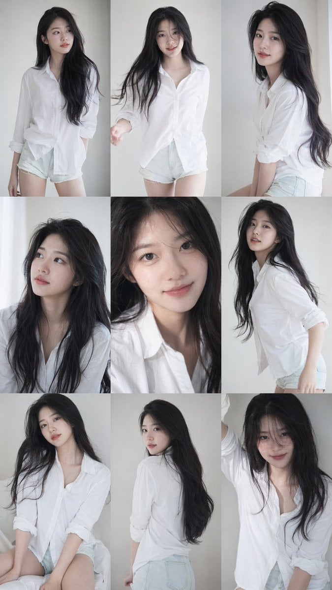
Image template
Featured
K-Pop Idol Nine-Panel Portrait Grid
No ratings yet
Portrait Photography
Realistic Photography
Cinematic

Image template
Featured
Japanese Negative-Film Rooftop Summer Portrait
No ratings yet
Portrait Photography
Realistic Photography
Cinematic
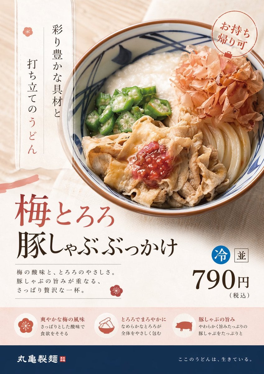
Image template
Featured
On-Trend Product Advertisement Redesign
No ratings yet
Ecommerce Product Images
Food
Drink
Ratings and feedback
No ratings yet
Please sign in first